Showing posts with label Research. Show all posts

Thursday, 28 April 2011

Article on David Hockney's Instant iPad Art


I was researching into the iPad online where I came across David Hockney's exhibition of iPad drawings! Here is the link to the article and video.
This really does prove how much technology is moving on and how much of an impact it is having on the art and design industry. There are new ways of getting your work noticed and out there. I think devices like the iPad have been a huge turning point for designers, for example, ebooks have opened up a whole new way of illustrating for on screen images, graphic designers are now having to come up with a new concept of text layout's for books that are displayed on a screen because the iPad is not a book ( I must remember to keep this in mind when working on my final major project). Animation is now possible and that's another field which has been opened up for animators which could become very popular for children's stories as it makes them much more exciting and interactive.
I find Hockney's idea of displaying his art work on lots of iPad's inspirational and perhaps I could do this for my end of year show?

Monday, 25 April 2011

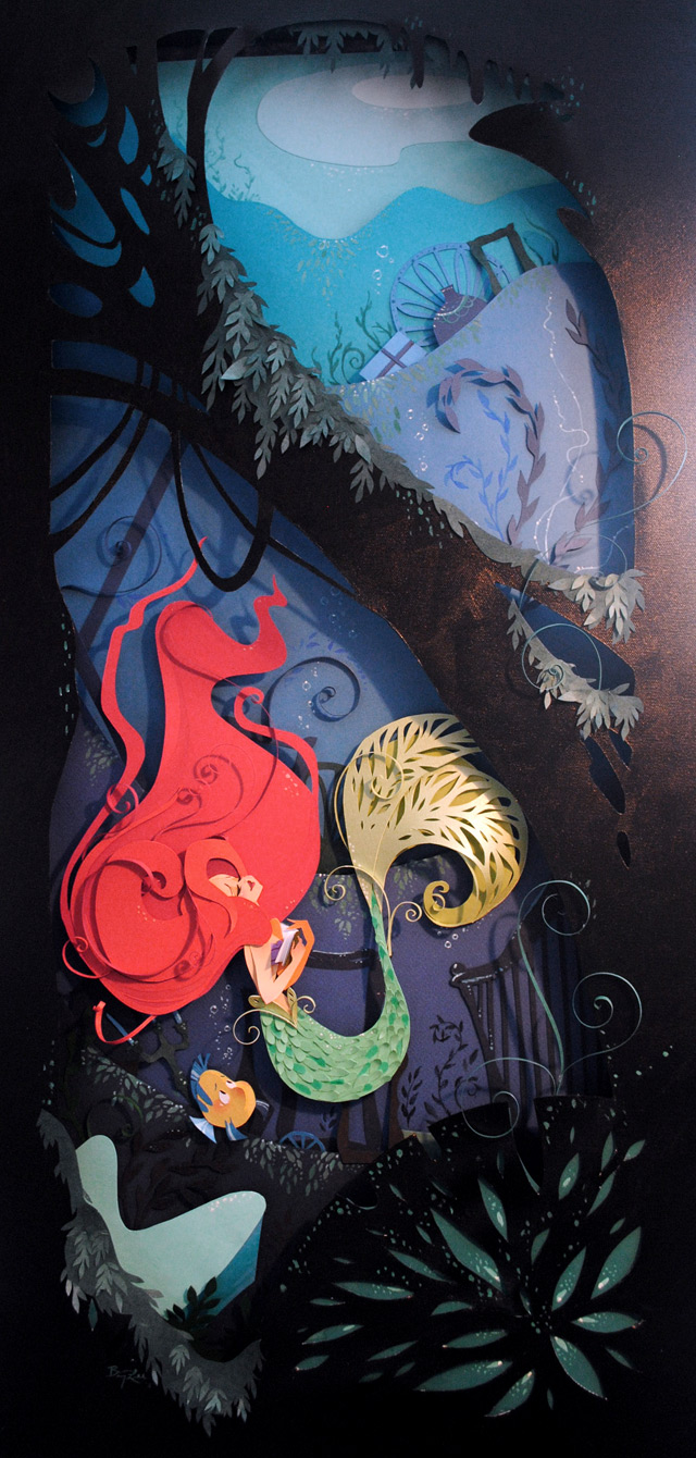
Brittney Lee


Brittney Lee is an artist who works for Disney. She works with the traditional process, with paint and with paper. The image of 'The Little Mermaid' is made from layers of paper. I think the attention to detail is so fantastic! I love the three dimensional aspect to her work, it gives her images depth and it lifts everything off the page in contrast to a flat painting.

Going back to the post we had to write called the 'Green Eyed Monster' before Christmas explaining how we wished we had could have made these works, Brittney's work makes me feel this way as well. I would love to be able to work this way, it's very similar to Cheong-ah Hwang's work. (I have a previous post of her work) they are both similar in a way that they both use paper as their main element to their work and they both have the illusion of the images coming to life from the page.

Brittney's work has elements of shape and pattern in her work, sometimes cutting out shapes from the paper and using the negative space to create a pattern or the image. Her work looks so precious because its very intricate.

Jo Lynn Alcorn


I came across Jo's work not long ago and I think it's fantastic! I found her when I was searching for designers who advertise products such as jewelery (like in these images) because I was taking Gillian Blease's advice, (an illustrator herself who does a lot of work for the Guardian) on photographing my own work with jewelery to put into my portfolio. I think this is the direction I am going to take when leaving the course as its something that I find really inspirational.

I have emailed Jo to ask a few questions and she has replied back to me, really quickly as well! I'm going to post her response in another post.

I read on Jo's website that she had done work for China and Japan and one of my questions was to see how she got an opportunity like this, as it is one of my ambitions to produce work and see other countries at the same time! (I should be so lucky!)

John Macfarlane's Set Designs for Cinderella


Here is a link to another video showing how the clock moves and animates.

I've been meaning to write this post ever since I since I saw this production of The Birmingham Royal Ballet 'Cinderella' at Christmas. I think this post is even more relevant now after Gillian Blease offered the advice of visiting theaters and inquire about set design.

What stood out most to me was the huge clock that was part of the set when Cinderella was dancing at the ball which is probably the most iconic moment in the story 'when the clock strikes midnight'. I thought it was hugely effective mainly due to the huge scale of the clock compared to everything else on the stage. It was dominating, and it represented the time ticking as the cogs were slowly rotating in sync with the music. Which was a constant reminder for the audience, emphasizing the tension in this scene.

The colours really worked in this production as well, for example, the clock acted as a silhouette and was lit from behind, so the shapes stood out and were a huge contrast with the rest of the drop cloth. The different scenery was quite simplistic throughout but still held an overall element of fantasy and authenticity. The use of neutral colours were ideal for vibrantly coloured lights projected onto almost blank canvases. The plain set was appropriate for the production because it put most of the emphasis and focus onto the dancers.

I've also found out what type of process set designers have to go through in order to demonstrate their ideas and designs for the set, they make smaller mock ups (models) with plenty of detail which is similar to what I do. Plus I think I'm a lot more comfortable with designing environments rather than characters.

I think researching into this has given me a direction I could choose to go in. I think it would definitely be worth taking Gillian Blease's advice by approaching a theater company and perhaps asking for a brief or some work experience.

Thursday, 21 April 2011

The Tale of the Three Brothers


Unfortunately I am unable to upload the video on my blog, but i have provided some images from the video and the link which is here

Wednesday, 20 April 2011

Jon Klassen and David O'Reilly


This animation was created by Jon Klassen and David O'Reilly. The main idea for the Swan and lilies image came from this animation. I like the movement of the swimming ducks on the black surface and you can see the ducks reflection in the lake. I could take some ideas from this when I create my own animations/interactions for the iPad.

This animation was for a music video and explores the three dimensional environments with abstract shapes and space.

Monday, 18 April 2011

Paper Origami by Japanese Artists


These are origami figures created by a variety of Japanese artists. I thought this was relevant to the way I work at the moment and was perhaps an inspiration as to how I could create my 3D characters. It's unbelievable to think these models were all made out of paper, the attention to detail is incredible.

I think the reason these photographs work well as images is because there is nothing, other than the one model/element in the image. This means there is plenty of focus on the character and its own detail. The space around the image helps to compliment them as well.

I've always struggled with the human figure in past projects and so far in my final major project I've found this to be the biggest challenge. I'm trying to make these characters look personal and also give them my own slant. I'm finding it hard to design them so they connect with the audience as well. Children are going to have to like the look of them or at least be intrigued by them.

I could perhaps apply a similar technique as in these images to my own photographing of the characters for them to be as strong as these images. It depends on whether I decide to make the characters 'cute' and likeable or to hold an air of mystery about them... If I were to make the characters 'cute', I don't think I'd capture the essence of the tale as well because it's a fairytale by 'Brother's Grimm' and their tales are known to be quite dark.

Monday, 11 April 2011

Zoe Bradley


Here is Zoe's website.

I was searching for examples of window displays because when I had a portfolio surgery with Gillian Blease, she suggested that I begin to photograph my models with jewellery to give some more examples of where my work could be seen. It would give my images a bit more context. So I thought I'd do a bit of research into some window displays and I found these lovely images of Zoe Bradley's installations for Tiffany jewellery.

These installations seem to hold an intricate elegance in them which compliments the beauty of the jewellery. I think my models such as the swan or the ballerina dress would work well in these contexts.
Su Blackwell also makes installations which are used to compliment Jewelery. A lot of these advertisements seem to be commissioned by 'Harper's Bizaar magazine'. I have seen Jo lynn Alcorn's work commissioned in this magazine as well who I have interviewed. Which I could do more research into and could end up as a potential contact in my client list.

Friday, 8 April 2011

Swan Image for H&G in iPad Formats


These are my first two attempts at the swan image in both portrait and landscape. I really like the contrast between the definitive man-made sculpture of the swan against the natural, flowing lines of the grass. Also the great contrast of the white on black works really well in this image. It has a Japanese feel to it, which I love. I think the composition is working and the use of space seems to be balanced well.

The text is easy to read although I still think it needs restructuring. The first sentence in both images needs shortening, I spoke to a graphic design student, Olivia and asked her opinion on the text and she mentioned shortening the sentences for easy reading, as if they are long it becomes tedious for readers. Since I'm aiming these images at children as well as adults, they need to be able to read the text and be kept intrigued.

I think the overall image is working very well, I like the angle in which I took the photograph but I may re-shoot it on different backgrounds such as a mirror or a black shiny background to get a reflection, which may make the swan and lilies look more like they are floating on a lake.

I have included an image of Jon Klassen's (I spoke of him in a previous post) work with this post because I got a lot of inspiration from his work and I took certain aspects of them in consideration for this image. For example his photograph of the ice sculpture influenced my idea to have the swan and white lilies on a black background which would represent the lake. I liked the sharp clear cut shapes of the iceberg which were in huge contrast against the black background which I tried to replicate with the white shape of the swan and the lilies. I have also added a natural element (the grass), to my image, to add some softer lines and to contrast against the man-made elements.

Friday, 7 May 2010

Brian Dettmer


Just recently come across these images by Brian Dettmer, I think there really unsual and i'd really like to find out how he has create these very complictaed sculptures. . .

Sunday, 2 May 2010

Paper Blossoms


These remind me of Emma Cassi's work and look just as beautiful! I love the colours in these photographs. They look like they have come straight from a fairy tale, I like the mystery of them, it reminds me of a princesses' palace. I love the way the flowers look as though they are blossoming through the wall, it gives the illusion of it not being a room or building but a magical forest instead.

Saturday, 1 May 2010

Cinderella Illustrations


These Cinderella illustrations were apparently produced alongside the Walt Disney Cinderella film. I think the difference is really interesting and I think I prefer these, as the Cinderella in these illustrations looks really cute but she doesn't seem as life like as the Walt Disney one. I really like the old fashioned style of them and I think the colours used give them that authenticity.

Emma Cassi


I really like Emma Cassi's idea here, the notion of making the patterns out of paper and actually making them look as though they are blossoming out of the wallpaper pattern. I liked the idea of it looking as though its transforming or growing out from the wall.

Wednesday, 28 April 2010

London and Rome are Burning


I uploaded this image on here because it's similar to what I like to produce at some point. I like the way the silhouettes are placed onto a background, in this case the fire, I think its really effective how you can see the fire burning behind what is supposed to be the skylines of London and Rome . I think it's such a simple idea but works brilliantly.