Showing posts with label PDP. Show all posts

Sunday, 15 May 2011

My email to Pheonix Yard Books

Hi,

My name is Gemma Beaven and i'm a student in my third year at Stockport College currently studying illustration. I'm nearing the end of my course now and I was just wondering if you could possibly give me some feedback on my work. What style of portfolio's catch your eye? How could I improve my PDF portfolio? Do you prefer illustrators to come and visit you in person to talk about work or is it easier for you to receive work by post or email? Is there any previous briefs that you could send and I could have a go at for some work experience?

Thank you for taking the time to read this email. I have attached my PDF portfolio to this email for you to have a look. I look forward to your response, any feedback or advice would be strongly welcomed!

Many Thanks!

Gemma

Response by Emma Langley:

Thank you for submitting your book proposal and/or illustrations to Phoenix Yard Books. We endeavour to respond to all manuscript submissions as quickly as possible but please allow up to 12 weeks for a response. Regrettably, due to the large volume of submissions we receive, we are unable to provide editorial comments and feedback on submissions.

ILLUSTRATORS: We do not reply to individual illustration submissions but we do keep all samples of artwork we like on a file that we refer back to as and when a suitable commission arises.

Thank you again for your interest in our company.

All best wishes

Phoenix Yard Books – Editorial

Phoenix Yard

65 King' s Cross Road

London

WC1X 9LW

Tel: (+44) 020 7239 4968


I also sent my online pdf to Jo lynn Alcorn who has already previously responded to my questions. I have asked for her feedback on my work for final major project and how I can possibly improve my work. We also exchanged people to research and look at who could inspire our work which was extremely helpful!

Saturday, 7 May 2011

Pocket Mirrors artefact


I can order 50 of these mirrors for £35 and all I have to do is upload my designs. I think they mirrors are mainly aimed at females but I think this compliments my work.

Wednesday, 4 May 2011

Response from Zoe Bradley


I emailed a lady called Zoe Bradley, who creates a lot of window installations ( I have a previous post on her work). I decided to look at her work after speaking with Gillian Blease down in London and she mentioned researching into window installations and theatre set design. Unfortunately Zoe couldn't answer my questions but her agent emailed me links and press to have a look at!

Hi Gemma,
Unfortunately, Zoe has alot of emails asking for information and due to her busy schedule is not able to answer all enquires, we ask that you look in our press files for information.
Best of luck,
Jo.

Thursday, 28 April 2011

Article on David Hockney's Instant iPad Art


I was researching into the iPad online where I came across David Hockney's exhibition of iPad drawings! Here is the link to the article and video.
This really does prove how much technology is moving on and how much of an impact it is having on the art and design industry. There are new ways of getting your work noticed and out there. I think devices like the iPad have been a huge turning point for designers, for example, ebooks have opened up a whole new way of illustrating for on screen images, graphic designers are now having to come up with a new concept of text layout's for books that are displayed on a screen because the iPad is not a book ( I must remember to keep this in mind when working on my final major project). Animation is now possible and that's another field which has been opened up for animators which could become very popular for children's stories as it makes them much more exciting and interactive.
I find Hockney's idea of displaying his art work on lots of iPad's inspirational and perhaps I could do this for my end of year show?

Cheong-ah Hwang's Response


Hi, Gemma,

Thanks for contacting me! I'm glad to answer your questions, but since writing in English is a bit challenge for me, and I need my studio time as much as possible these days, I'll do that a little bit at a time, if it's ok with you.

Q: What kind of things are you inspired by? Do you have any particular designers that you look at? Are you inspired by literature?

A: I get inspired by other people's work. It can be any art form such as performing arts, literature, visual arts. It doesn't have to be professional artists' work. A well-made wonderful piece of art can be created by anybody.

Q: You create some stunning paper cut images, did you attend any paper craft classes or did you teach yourself these skills?

A: Thank you. I did not take any classes for that. I learned all my techniques through "Paper Sculpture: A Step-By-Step Guide", and "More Paper Sculpture" by Kathleen Ziegler, and Nick Greco. Skills are not hard to learn, but those books have many wonderful paper sculpture artists' work that shows how they apply those techniques to their pieces. These days, I find more paper sculptors on line.

To be continued......

Best,
Cheong-ah


Q: You work with a lot of paper, what other tools do you like to work with?

A: I use Exacto knife, Scissors, embossing tools, sculpture tools, but my favorite and the tool I use the most is my fingers. I took clay sculpture classes when I was teen. I tend to treat the paper like as if it's clay.

Q: I especially love your images of 'Alice in wonderland' and the 'Little Red Riding Hood' image, did you sketch out the composition all of these images out first and then begin to construct the paper layers?

A: That's right. Sketch is very important part of my work process.

Q: How do you create the three dimensional effect within your images? I think this is a fantastic skill, it brings all your work to life!

A: Thanks. I put a little piece behind shapes. You can see it here. http://www.flickr.com/photos/papernoodle/sets/72157625072437644/ When your work is just for printed material, you can put any supports like foam board. I make my supports in the way that they can blend with the sculpture as much as possible because those supports can be seen in the original piece in person, and it's very ugly.

To be continued.....

Q: Do you photograph all your work yourself or do you have to work with a professional photographer to get the perfect shots?

A: I take photographs. It's incredibly difficult for me. Working on Photoshop helps me a lot.

Q: What kind of briefs or commissions do you think your style of work lends itself well to?

A: I'd really like to get illustration commissions for storybooks. That'll be my dream come true.

Q: And my last question is : Would I be able to display this information onto my blog?

A: Yes, of course. Thanks for blogging about my work.


Gemma, good luck on your future!

Best wishes,

The London Trip


At the start of April, I ventured into London with some other students and my tutor, Gary, where we visited some commissioning clients and had portfolio surgeries with some respected practitioners who are now working in the design industry.

I thought this was a great opportunity and I'm very grateful to our tutors who helped organise this for us, as it gave an insight as to what commissioning clients expect from an illustrator. We were also given constructive feedback from people who have already gained lots of experience in the industry. I felt lucky to have their opinions and input as they provided us with direction, which I think was very useful as I'm nearing the end of the course now and this advice was very welcomed.

Billington Cartmell

On the Monday evening, I attended a portfolio visit at a company called Billington Cartmell who work mainly in advertising. We all sat around a table and one by one showed them our portfolios. There were six people viewing our portfolios and they all gave us valuable feedback on our work. I thought this was a good step as the atmosphere was quite laid back and it was a nice warm up/preparation before the rest of the visits we had planned over the next two days.

They mentioned that my work was well suited to advertising briefs and they asked me if I had been in touch with fashion agencies and magazines like Vogue. This was quite a shock to me because I didn't see my work as being suited to that particular genre but this has now made me consider other ways of displaying my work which may get me noticed by different companies and open up more opportunities for me.

My image of the house in Hansel and Gretel for the iPad was something that sprang out to them because it seems really up to date. Someone mentioned that if I found different ways to make the story interactive and consider possible animations then it would be something that would really spring out from my portfolio and make them think 'whooah'. He advised me to look at 'Wired Magazine' (which I was already aware of and have a previous post about) and their new ideas towards E-magazines and the interaction ideas where an advertised product would rotate 360 degrees when tapped. This feedback gave me a lot of confidence and motivation in my final major project.


They also said that if I wanted some work experience I could inquire about it when I finish the course. I think I may consider this as it would be good opportunity and, would no doubt be, something to put into my portfolio! I just have to get into contact with Tom Genower after I graduate!

Faber and Faber

On Tuesday morning, we attended a meeting with Faber and Faber, a book publishing company. We spoke to a woman called Donna Payne and two other very helpful people. I thought this was the most useful visit of them all because they provided us with really helpful advice and I now have a much better understanding of the process of being commissioned. I have never properly understood the importance of providing 'rough sketches' for commissioner's but seeing the amount of drafts and images for each of their finished images (AT LEAST 15 STEPS!) really highlighted the importance of roughs. I think this really hit home and made me realise fully how much I need to do of this in my own projects.

We asked them how they prefer to receive examples of our work and what sort of things they like to get in the post. They initially said they firstly and formerly prefer online pdf files, containing around 6 images and if possible two images to a page. They said they are not impressed by fancy parcels or small printed out books that have been folded in a creative way and tied up with ribbons. They just like to be able to tell what it is you do, the style of your work and what each image is. They explained that they don't have the time to search and properly look at fancy things, they just want to quickly find someone who looks like they will be capable of producing work for a particular brief.

They mentioned that it always helps if you can be found easily on the internet, so having your own website really helps. They like to see a simple, easy to use website where they can view your portfolio straight away and find your contact details easily. I have since looked into this and it is something I could build up after this course is finished.

Another great piece of advice was to always ask for names (or business cards where possible) and keep notes on all of them because the more contacts that you have the greater your chances of getting commissioned. People are a lot more impressed if you have taken liberty of finding out their names and it adds a personal approach which helps to build good working relationships.

After seeing Faber and Faber, I think I now understand more clearly the process of being commissioned and how many people have to be involved within the process. Until now, I have never really seen the importance of being able to produce 'roughs' for a commissioner but now it has become obvious how important that process is and it's what they really want to see before the finished thing. In light of this knowledge I intend to get into the habit of doing this starting with my final major project.

Big Orange Illustration

When visiting Paul Davis and Robin from Big Orange they really gave us an insight into what it is like to be a practitioner in the design industry right now. They mentioned the values of sharing a huge space with several other practitioners, and how they were always constantly inspired and motivated by others. And because there are a lot of people using and paying for one huge room, the rent is actually considerably cheaper!

The advantages and disadvantages on having your own agent were discussed as well and there was a question which we were left to ponder, 'will an agent benefit me in any way?' One thing they did make clear was that if you do somehow 'manage' to acquire an agent, don't think that this will sort everything out for you, you may not get that much more work. The main advantage of having an agent is that you don't have to deal with money aspect and whether or not your getting enough money for the work that you have put in.

We were also warned to watch out for agencies who tend to boast of many illustrators joining their ranks, this in fact only makes your work harder to be seen because of all the other illustrator's work. When commissioners are browsing these websites which feature two hundred illustrator's portfolios they easily forget your work and it's much harder to stand out.

Currently agents tend to get you about 20% of your total work and you have to get the other 80% by promoting yourself. Self promotion is the most important thing for an illustrator to do, it's just as important as the work you produce if not MORE important.

They also spoke about your actual portfolio very rarely getting seen by art directors, everything these days seems to be done by sending your online PDF portfolio to commissioning clients. So this is something I'm going to have to work on to get absolutely perfect.

Association of Illustrators

We also had a meeting with the AOI (Association of Illustrators) who also rent a part of that same room and they gave us great advice on why we should join the 'Association of Illustrators'.

These were the main things we were given to think about:

    * We were advised to join while we are still students because we would get the whole year's benefits for a cheaper price.

* They are good at protecting young graduates like ourselves who might be naive about the industry because we have little experience. Apparently to advertising commissioners we are 'fresh meat' and they will try and get us to do jobs and take advantage of us by paying far less than they would for an experienced practitioner.

* We could see people who would do professional surgeries on our portfolios and would provide us valuable feedback.

Portfolio surgeries with Gillian Blease and Andrew Pavitt

I thought this was one of the most helpful visits, aside from Faber and Faber as we were given professional guidance and advice from two very experienced and highly respected illustrators, Gillian Blease and Andrew Pavitt.

We were given pretty much one on one time with each professional who not only provided feedback on our portfolios but were able to give their own personal input and make different suggestions which would aid us in the direction we wanted to head in.

The advice that really stood out to me was

Andrew Pavitt:

* 'Stick with the style you have and keep at it, no matter what trends and styles seem to be successful at the time, if you conform to other styles that aren't really you, you will sink'

* 'Keep self promoting, even if you aren't making money from it, always find a way to get your foot in the door, it's that break through that you really need, once that happens it should all fall into place soon after'

* ' This is the most important year, just when you are finishing as a student and you have fresh ideas and lots of inspiration'

* 'Make sure what you are doing you are passionate about'

Gillian Blease:

* 'Always think how would an art director like to view your portfolio, what would they like to see? Things in context always help an art director because then they don't have to imagine it themselves'

* 'Get out there, go to theaters and ask for work experience or volunteering on set design'

* ' Visit shops and offer to do an attractive window display for free and then take picture for your portfolio, more work experience'

Overall their input was really insightful and I will certainly take their advice on board. It was really helpful to hear another professionals opinion on your work because then you can tell whether something you have produced is communicating the write message or is as successful as you first thought. They were ruthless whilst searching through the portfolio's but in a constructive manner, from which I am very grateful.


Wednesday, 27 April 2011

Gail Armstrong's Responses to my Questions :)


Hi Gemma


I'm happy to answer your questions for you - I'm so glad you like my work. I remember being at this stage in my degree course and I really didn't know what I was going to do next!! I'll try to answer your questions as fully as I can.

> What kind of things are you inspired by? Do you have any particular designers/ artists that you look at?

I'm often inspired by a piece of paper in fact - I spend a lot of time in the paper department of Paperchase on Tottenham Court Road and spend a fortune in there. The real inspiration tho comes from the brief and in talking to my client - it's the difference for me between being a fine artist and an illustrator - I work at my most creative with a few boundaries to push. Even when I'm working on personal projects I work best if I have some kind of brief for myself in mind. Artists and designers that I love and that do inspire me are Cassandre, Erte, Andrew Goldsworthy, Pugin and Norman Rockwell.

> From looking at your work, your clearly very talented at what you do, especially with paper, how did you develop your skills for them to become this advanced? Have you attended paper craft classes of book binding?

I was one of those kids who always made everything on Blue Peter and transforming cardboard boxes into doll's houses. I did my degree and postgraduate at Glasgow School of Art in both Graphic design and illustration and they were very good at getting visiting lecturers from London (the centre of the british design industry then) to come and do workshops. One of those was in paper sculpture and I just felt right at home with it as a medium. Although I'd gone to Glasgow to specialise in Illustration, by the time I left in 1987 I'd changed over to specialise in Graphic design. I had a wonderful month's work experience with Milton Glaser in New York during my PostGrad and then landed my dream job with The Small Back Room in London. As a design consultancy their house style was quite illustrative, with all the designers being very conceptual and creative individuals. We were encouraged to learn new skills (including bookbinding) as well as continue to keep up existing skills through workshops such as life drawing.
It was an extremely motivating and inspirational place to work, so when I left there I freelanced in several different design consultancies rather than be employed by one and worked part-time as a lecturer whilst starting to to myself established as an illustrator in paper sculpture. Gradually I moved away from design and teaching and into full-time illustration.

> When you begin designing your image, do you sketch out the composition first or do you jump straight in to creating the layered paper elements?

I always have to draw everything out first and I'm working out the logistics of how the mechanics of the image will work at that stage. It also means I have a line drawing for the client to approve and that they can use as a position guide for text whilst the actual piece is being constructed.

> How do you get the layers to suspend on top of each other on their own?

It depends on the individual image. Many of them are built in false perspective and I have to plan overlaps of the elements so that I can put in supports between the differnt layers and elements. Sometime the photographer has to suspend pieces with fishing line which get retouched out later.

> Do you work with a photographer and professional lighting equipment, when taking photos of your work to get the perfect shot?

sometimes the client wants to use their own photographer, but mostly they're happy to go with my recommended photographer, Jonny Thompson, who I've worked with for years. (www.jonnythompson.co.uk). Although he works directly for the client, all the shots come to me first for comment before the client sees them, so I do have control over how the finished image looks.
There's also a second way I have of working which is more of a digital collage. I make the pieces as individuals, but either scan them or take very simply lit digital shots of them and then comp the image together in Photoshop. The pieces have a different end feel from photography - less atmospheric, I suppose - but it works particularly well for jobs where there is no time or budget for photography, or where it is likely that elements will need to be added/moved/removed etc. and so more flexibilty is needed to alter the artwork.

> Whats your favorite brief that you have been commissioned by and why?

So many! I loved the Kleenex job in particular tho - the designer I worked with was excellent and gave me free rein with every aspect of the image, including the typography (the main thing I miss about being a graphic designer is the playing with type), and I loved the ideas he'd come up with. It's a set of work that has since won loads of awards so no wonder I like it!

> What type of work do you get commissioned for? for example, Is it mainly publishing, advertising or editorial?

It changes - lately more advertising work. When the credit crunch hit I was doing a lot of editorial, making images from money to illustrate articles on finance. I used to do a lot of images for children's publishing. It varies. One of the major advantages of being an illustrator is that there's always something new to work on - one or two little animation jobs have started to creep in so it would be nice to do some more of that.

> And for my last question: Can I display this information onto my blog?

Of course! Also would you put a link to the illustration website
www.illustrationweb.com/gailarmstrong
There's also a Facebook page if you want
www.facebook.com/pages/Gail-Armstrong-Paper-Sculpture-Illustration/114601065239309

Good luck with the final stages of your course - I'd like to hear how you get on if that's OK.
All the best
Gail

Tuesday, 26 April 2011

Jo Lynn Alcorn's Awesome Words IN BOLD


Hi Gemma,

First of all, it's so nice to hear from a young artist like yourself...I am wondering where you heard about me. Thank you for your interest in my work. It is gratifying to know that it has some interest and value beyond the obvious commercial applications.

I would be glad to answer your questions, and it is fine if you want to put them on your blog. I WILL ANSWER THEM IN BOLD.

I would also like to know something about you and your work, and what you want to do after you get out of college.

So please keep in touch!

Best,
Jo Lynn

On Mon, Apr 25, 2011 at 10:48 AM, gemma beaven <gemmabeaven7@gmail.com> wrote:
Dear: Jo Lynn Alcorn

My name is Gemma Beaven and I am a student at Stockport College in Manchester, currently in my third year studying illustration. I was wondering if i could ask you a couple of questions about your work, as I think it's fantastic! I'd really appreciative your input and advice as I'm coming to the end of my degree, so any direction would be welcomed. These are the questions I'm really eager to ask you:

Your work looks very cultural and a lot of it has lots of nature in them, when you create these stunning paper collages, what types of environment inspire you? Do you have certain designers you look at? Are you inspired by literature at all?

I AM DEFINITELY INSPIRED BY NATURE. I REALLY LOVE TO LOOK AT ANY AND ALL TYPE OF PLANTS, SHELLS, INSECTS, ANIMALS. I HAVE A SMALL COLLECTION OF SPECIMENS THAT WAS REALLY STARTED BY MY SON WHEN HE WAS LITTLE. WE COLLECTED NATURE TOGETHER THEN, AND I STILL PICK UP SHELLS AT THE BEACH, OR BUTTERFLIES OR FEATHERS, OR WHATEVER.

I OFTEN LOOK AT THE WORK OF PHOTOGRAPHERS WHO PHOTOGRAPH NATURE. ONE I PARTICULARLY LOVE IS KARL BLOSSFELDT. HE WAS A 19TH CENTURY GERMAN PHOTOGRAPHER WHO MOSTLY TOOK PICTURES OF SEED PODS, AND FLOWERS AND PLANTS AFTER THEY WERE DONE FLOWERING. BUT HE STARTED OUT AS A WROUGHT IRON CRAFTSMAN, AND YOU CAN SEE THE CONNECTION BETWEEN THOSE DESIGNS AND THE "DESIGNS" IN NATURE. ROBERT MAPPLETHORPE'S NATURE PHOTOGRAPHY IS AMAZING TO LOOK AT, AS IS IRVING PENN'S (INTERESTINGLY HE WAS KNOWN FOR HIS FASHION WORK, NOT SO MUCH THESE).

FOR COLLAGE INSPIRATION THERE IS MATISSE, OF COURSE!, ROMARE BEARDEN, ERIC CARLE, THE CHILDREN'S BOOK AUTHOR.

AND I LOVE THE WORK OF CHARLIE HARPER WHO WAS A MASTER DESIGNER. HE STYLIZED BIRDS AND OTHER NATURAL FORMS TO THE MOST ELEGANTLY MINIMAL STATE. SO TAKE A LOOK AT HIM. I LOVE ALL THE OLD JAPANESE WOODBLOCK ARTISTS. AND I THINK, SINCE I WAS A PRINTMAKING MAJOR IN COLLEGE, I DO THINK IN TERMS OF LAYERS, WHICH LENDS ITSELF TO MY CUT PAPER TECHNIQUE,
AND IS ALSO HELPFUL IN WORKING IN ILLUSTRATOR ON THE COMPUTER. I BASICALLY THINK IN SHAPES, TEXTURES, COLORS, LAYERS.

FOR SHEER BRILLIANCE IN AN ARTISTIC RELATIONSHIP TO AND WITH NATURE, I LOOK AT ANDY GOLDSWORTHY, THE CONCEPTUAL ARTIST. BUT THERE ARE SO MANY INFLUENCES AND THINGS TO LOOK AT...THESE ARE JUST A FEW.

WHO ARE YOU INSPIRED BY?

By looking at your work, you seem to be incredibly talented at what you do especially working with paper, have you attended book binding classes or paper craft classes to develop your skills? Do you cut everything out by hand?

THANKS! I DID TAKE A BOOKBINDING CLASS IN COLLEGE, THOUGH I DON'T REALLY THINK THAT ENTERS MUCH INTO WHAT I ENDED UP DOING, BUT PERHAPS THE LOVE OF PAPER STARTED THERE. IN PRINTMAKING TOO, THERE WERE ALWAYS THE PAPERS TO BE CHOSEN, AND I LOVED THAT. I NEVER TOOK A CLASS IN PAPER CRAFTS OR PAPERMAKING (I'D LIKE TO!), SO I GUESS YOU'D SAY I'M SELF TAUGHT. I THINK OF MYSELF AS A REALLY GOOD PROBLEM SOLVER BEFORE ANYTHING ELSE.

You use a lot of paper in your work, what other tools do you like to work with?

SOMETIMES I PAINT AND PATTERN THE PAPERS, USING GOLDENS ACRYLIC PAINTS. I LIKE TO CREATE PASTE PAPERS, WHICH INVOLVES ADDING PASTE TO PIGMENT (SOMEWHAT LIKE FINGER PAINTS, IN THAT YOU APPLY A UNIFORM COAT OF THE COLORED PASTE AND THEN CREATE PATTERNS BY COMBING THROUGH IT OR EVEN USING YOUR FINGERS). FUN! I USE ARCHIVAL WHITE GLUE, 2 SIDED FOAMTAPE, AND 2 SIDED FILM TAPE FOR ADHESIVES. I USE BALSA WOOD AND FOAM CORE FOR BUILDING UP THE ELEMENTS OF MY ILLUSTRATIONS TO MAKE THEM MORE DIMENSIONAL. SOMETIMES I RAISE THE ELEMENTS UP BY GLUEING THEM TO ALUMINUM RODS WITH A GLUE GUN AND STICKING THEM INTO THE FOAMCORE BOARD WHICH IS THE BASE OF THE ILLUSTRATION. I USE EXACTO KNIVES AND GOOD QUALITY SCISSORS TO CUT OUT MOST PIECES, BUT RECENTLY I DID GET A ROBOTIC CUTTING MACHINE AND IT DOES INCREDIBLE WORK. I CREATE THE TEMPLATES IN ILLUSTRATOR AND SEND THEM TO THE MACHINE USING SPECIAL SOFTWARE.

When creating an image, how do you design the layout or the composition? Do you sketch it all out first and then begin to construct your paper collages? Or do you construct your paper elements and then try and design the composition?

I SKETCH IT OUT FIRST WITH PENCIL AND MARKER. I USUALLY DRAW AND THEN SCAN EACH ELEMENT WITHIN A LAYOUT SEPARATELY. THAT GIVES ME MAXIMUM FLEXIBILITY. SO FOR INSTANCE, WITH THE INDIAN JEWELS PIECE, I HAD A SEPARATE SCAN FOR EACH ELEPHANT, DANCER, FLOWER, LEAF, ETC. THEN I COULD MOVE, RESIZE, RECOMPOSE AS MUCH AS I WANTED. ONLY AFTER THE CLIENT APPROVES THE SKETCH DO I BEGIN TO CUT. THERE ARE EXCEPTIONS...SOMETIMES THE CLIENT WANTS TO SEE A SAMPLE OF WHAT THE PAPER ART WOULD LOOK LIKE, SO I DO THAT FIRST.

My favorite images of your work are the 'Indian jewels' compositions, how did you incorporate the jewellery into your images, did you plan this in the composition beforehand or did you add them in as a later element?

I HAD LOW RES IMAGES OF THE JEWELRY, WHICH I INCORPORATED INTO MY SKETCHES. THAT JOB WAS ACTUALLY A LOT OF FUN, BECAUSE THEY GAVE ME COMPLETE FREEDOM TO FIGURE OUT HOW AND WHERE TO USE THE JEWELS. THEY JUST ASKED THAT I USE THEM TO MAKE AN INDIAN WEDDING PROCESSION. SO THE CONCEPTUAL PART OF IT WAS A BIG CHALLENGE.

How do you create the three-dimensional aspect to your work?

FIRST, THE PAPERS ARE OFTEN FOLDED OR CURLED OR CREASED, ANYTHING TO CREATE DIMENSION AND PICK UP LIGHT. THEN THE WHOLE PIECE IS BUILT IN RAISED LEVELS, USING THE FOAMCORE, BALSA, OR ALUMINUM RODS I MENTIONED BEFORE.

ANOTHER VERY IMPORTANT ASPECT TO THE DIMENSIONALITY IS THE LIGHTING...THIS IS THE WORK OF THE PHOTOGRAPHER, WHO WORKS TO CREATE INTERESTING SHADOWS. WHITE ON WHITE PIECES ARE SPECIAL CHALLENGES IN TERMS OF PHOTOGRAPHY.

MY WORK IS ALWAYS PROFESSIONALLY PHOTOGRAPHED. I SHOULD MENTION THAT THIS IS AN IMPORTANT ISSUE WHEN IT COMES TO THE FEE FOR MY WORK, BECAUSE IT IS A COST ON TOP OF MY OWN FEE. THE PHOTOGRAPHER IS PAID SEPARATELY, AND THE CLIENT MUST UNDERSTAND THAT IF THEY WANT MY WORK THEY HAVE TO PAY THIS ADDED CHARGE. SOMETIMES THEY DON'T WANT TO!

Its says on your website that you have done a lot of work for China and Japan, how do you get into this kind of work? How did that sort of opportunity come by?

YOU MENTIONED THE INDIAN WEDDING PIECE. THAT PIECE HAPPENED TO BE PIVOTAL IN MY CAREER BECAUSE IT WAS MY FIRST WORK FOR FASHION, EVEN THOUGH IT WAS EDITORIAL. IT KIND OF LAUNCHED ME IN THE NICHE OF "EMBEDDING PRODUCTS IN ILLUSTRATIONS." I WAS VERY FORTUNATE TO BE NOTICED AND HIRED BY A GREAT CREATIVE DESIGNER NAMED RICHARD CHRISTIANSEN, WHO NOW HAS HIS OWN CREATIVE FIRM NAMED CHANDELIER CREATIVE. IT WAS AN EXCITING JOB, AND IT LED ME TO MANY OTHERS.

I WAS HIRED SOON AFTER BY RICHARD TO DO THE SHANGHAI TANG CATALOG, AND ALSO WORKED WITH HIM ON SEVERAL THINGS FOR LANE CRAWFORD. EVENTUALLY, I WAS INVITED TO DO A MURAL IN BEIJING FOR LANE CRAWFORD, AND WENT THERE IN 2007. I AM SET TO DO AN INSTALLATION IN HONG KONG FOR LANE CRAWFORD IN MAY.

SO ONE THING LEADS TO ANOTHER, AND SOMETIMES ALL YOU NEED IS ONE GOOD BREAK. AT THE TIME THAT I DID THE INDIAN JEWELRY JOB, I WAS MOSTLY DOING CHILDREN'S EDITORIAL ILLUSTRATION, BUT STRUGGLING BECAUSE AS YOU PROBABLY KNOW, IT PAYS VERY LITTLE...AND NO ONE WANTED TO PAY THAT EXTRA PHOTOGRAPHY CHARGE.

I ALSO FELT I WANTED TO DO SOMETHING MORE SOPHISTICATED AND ELEGANT, AND SO WHEN I GOT THAT ASSIGNMENT TO DO THE INDIAN JEWELS IT WAS JUST PERFECT. I ALSO DID THE MACY'S FLOWER SHOW AT AROUND THE SAME TIME. I WAS TURNING 50 AROUND THEN, SO IT FELT LIKE A PRETTY NICE BREAK!

IT ALSO CONNECTED ME WITH A PHOTOGRAPHER WHO I HAVE SINCE WORKED WITH MANY MANY TIMES AND HE IS MY FAVORITE PHOTOGRAPHER OF MY WORK. HE IS A JAPANESE PHOTOGRAPHER NAMED KANJI ISHII.

You do a lot of advertisement briefs, how long do you usually get to create an image for one of these briefs? Also how did you get into this type of work within the industry?

IT DEPENDS, BUT USUALLY TIME IS VERY SHORT, TOO SHORT. THE TIME FRAME IN ADVERTISING IS YESTERDAY!

I NOW HAVE AGENTS, FARIMAH MILANI IN NEW YORK, AND LT2 AGENCY IN PARIS. THEY ARE VERY CONNECTED WITH THE WORLD OF ADVERTISING, FASHION, COSMETICS, SO THEY GET ME ALL THIS GREAT WORK IN THE INDUSTRY. I AM VERY LUCKY.


And for my last question, would I be able to display this information onto my blog?

YES, OF COURSE.

AS FOR ADVICE, I WOULD SAY, JUST WORK HARD, KEEP AT IT, AND MAKE SURE YOU'RE STILL HAVING FUN. I ONLY STARTED TO GET ANYWHERE WHEN I RELAXED AND DID WHAT I WANTED TO. TAKE RISKS, DON'T BE AFRAID. STEP OUT! TRY TO GET AS MUCH EXPOSURE AS YOU CAN...DO YOU HAVE AN ONLINE PORTFOLIO?

I REALLY DO BELIEVE THAT IF YOU'RE GOOD AT WHAT YOU DO, EVENTUALLY YOU WILL GET NOTICED. IT MAY TAKE A LONG TIME, SO HANG IN THERE!

HOPE THIS HELPS!

BEST,

JO LYNN

Monday, 25 April 2011

Jo Lynn Alcorn


I came across Jo's work not long ago and I think it's fantastic! I found her when I was searching for designers who advertise products such as jewelery (like in these images) because I was taking Gillian Blease's advice, (an illustrator herself who does a lot of work for the Guardian) on photographing my own work with jewelery to put into my portfolio. I think this is the direction I am going to take when leaving the course as its something that I find really inspirational.

I have emailed Jo to ask a few questions and she has replied back to me, really quickly as well! I'm going to post her response in another post.

I read on Jo's website that she had done work for China and Japan and one of my questions was to see how she got an opportunity like this, as it is one of my ambitions to produce work and see other countries at the same time! (I should be so lucky!)

John Macfarlane's Set Designs for Cinderella


Here is a link to another video showing how the clock moves and animates.

I've been meaning to write this post ever since I since I saw this production of The Birmingham Royal Ballet 'Cinderella' at Christmas. I think this post is even more relevant now after Gillian Blease offered the advice of visiting theaters and inquire about set design.

What stood out most to me was the huge clock that was part of the set when Cinderella was dancing at the ball which is probably the most iconic moment in the story 'when the clock strikes midnight'. I thought it was hugely effective mainly due to the huge scale of the clock compared to everything else on the stage. It was dominating, and it represented the time ticking as the cogs were slowly rotating in sync with the music. Which was a constant reminder for the audience, emphasizing the tension in this scene.

The colours really worked in this production as well, for example, the clock acted as a silhouette and was lit from behind, so the shapes stood out and were a huge contrast with the rest of the drop cloth. The different scenery was quite simplistic throughout but still held an overall element of fantasy and authenticity. The use of neutral colours were ideal for vibrantly coloured lights projected onto almost blank canvases. The plain set was appropriate for the production because it put most of the emphasis and focus onto the dancers.

I've also found out what type of process set designers have to go through in order to demonstrate their ideas and designs for the set, they make smaller mock ups (models) with plenty of detail which is similar to what I do. Plus I think I'm a lot more comfortable with designing environments rather than characters.

I think researching into this has given me a direction I could choose to go in. I think it would definitely be worth taking Gillian Blease's advice by approaching a theater company and perhaps asking for a brief or some work experience.

Sunday, 24 April 2011

Hopes, fears and opportunites

Progress:

Third year has really helped move my work on, I think mostly because I have had the opportunity to choose my own projects, so I was able to delve into areas that really interest me and I was able to work towards a specific genre or area of focus within the design industry. I think I have gained more of an understanding where my work is heading and what type of work I could possibly get commissioned for.

I think I am moving closer towards being a practiced illustrator but I know I still have a lot more grafting to do, to get myself at the stage where I can safely say ‘ I’m ready to venture into the design industry’. However the London trip gave me a lot of confidence and motivation. We were given the opportunity to speak to commissioning clients who were able to provide valuable feedback. In addition we had portfolio surgeries with highly respected illustrators/practitioners who were able to offer constructive criticism on our images and our overall presentation of the portfolio. If it wasn’t for the London trip I would still be pondering on whether my work is fully developed or ready for real life briefs. However I now know my work could get there if I applied some of the advice I was given while on this trip. I’ve realised I still have a lot more work to do, not only on my work but on my portfolio as well. After speaking to different people from the industry I think I have a better understanding of what commissioners want from a portfolio visit and what mind frame they have when viewing a portfolio (what it is they are looking for before they have seen it.)

My work seems to be moving forward in a sense that I’m now producing better quality models/sets. Although there is still room for improvement in the quality control, as sometimes my models can lack in quality, one of my assessments mentions that the making was, in some instances, more clumsy than charming. I will definitely be the first one to admit that this is true. However I think recently my making has improved and has mainly stayed on the charming side rather than the clumsy. Gillian Blease, an illustrator, mentioned that I could attend bookbinding / paper classes in order to develop and improve my skills, which I think is something I will consider as I’m really interested in seeing how other people approach these ways of creating.

I’d like to be at the comfortable stage where I can make effective decisions, this is one of the most important tools/qualities an illustrator needs, so they can assess for themselves when something is finished or if something is missing from the image. I need to consider space in an image a lot more and the effect this could have when used effectively with my detailed models. ‘Less is more’ as my tutor Ian Murray reminds me! I need to keep a constant reminder that space can be a very valuable tool or element to an image; it can compliment an image or give it that extra flourish that my work tends to miss sometimes. With my Final Major Project I have thought about a lot of these things and I think I have produced considerably better results/images because of these thoughts.

My Fears of finally entering the industry:

One of my biggest fears when leaving this course is not having all the specific facilities or equipment in order to produce high quality images. My method of working requires a good camera and lighting for the photography, which may cause some problems for the near future. I think investing in some of this equipment would probably be a wise choice. I have considered collaborating with a photographer but unfortunately I haven’t been so lucky as to meet someone who is willing or desires the same things. Not yet at least! I think this notion of collaboration seems to be the next step for practitioners in the design industry. It's seen as a way of producing twice as much work than you would do so on your own and in addition having that other person's opinion or input that could develop an idea or push your work to the next level.

Another fear is losing contact with fellow students and tutors. Going back to what I just mentioned, I think it’s important to get another person's opinion on your work. I think my work needs this in order for it to stay current and not turn stale. So avoiding isolation will be something to think about. A studio space with several other people working in there would be an excellent and its definitely on my wish list but there are alternative ways to keep up with trends and styles by attending galleries, shows or lectures.

Managing my time has always been an issue in the past, so that’s something that has been one of my concerns while on a real life brief. And not only that, working on several briefs at once I think I will find a struggle as my working method is quite slow, it's not as fast and reliable as I'd like it to be. I think recently I have improved on this, during my Final Major Project, as I’ve had a lot more time to experiment in the photography room and I’ve left enough time to get some great images because of this. I think perhaps my work is suited to larger projects that are given enough time. I’m certainly going to have to think of a solution as to how I could speed up my process for some commissions that will probably serve me better in the long run.

And finally self-promotion, I think this is the most vital skill an illustrator needs in order to be a competent, successful and thriving practitioner within the design industry. 'You can be amazing at what you do but if no one sees it then it’s a waste of talent.' This has been drummed into our ears a lot recently, which is understandable since it is obviously a huge factor in making it in this line of work. Getting your work out there is just as important as making imagery. I think this is one of my biggest fears (if not everyone else’s) but I think the best way to tackle this fear is to 'bite the bullet' and get out there and while I’m at it and build up a ‘thick skin’ for myself. Not everyone will like or take preference to my work and this is something I have to experience sooner rather than later so I can get past it.

Opportunities:

This course has given me so many prospects for the future. I think the most helpful part was the trip to London, which was very thoughtfully set up by our tutors. I feel very lucky to have been a part of that opportunity as we were given enough guidance and confidence to visit different commissioning agencies and illustrators. Which really was a big ‘eye opener’ for me, as I got a better understanding as to what the industry expect from us illustrators and what we expect from them. I think approaching these companies was really the hardest part and now that I’ve been helped to overcome that I think I’m closer to tackling this kind of thing again myself. If I had attended any other university I don’t think I would have got as much help, advice or even input off the tutors as that which I have gained from choosing to study at Stockport College.

Hopefully with my newly found confidence and motivation I can now leave this course and take with me some great advice and pursue my own ambitions. I look forward to finding other opportunities that are out there and I think my main aims and ambitions lie in the publishing and advertising areas.


Monday, 11 April 2011

Zoe Bradley


Here is Zoe's website.

I was searching for examples of window displays because when I had a portfolio surgery with Gillian Blease, she suggested that I begin to photograph my models with jewellery to give some more examples of where my work could be seen. It would give my images a bit more context. So I thought I'd do a bit of research into some window displays and I found these lovely images of Zoe Bradley's installations for Tiffany jewellery.

These installations seem to hold an intricate elegance in them which compliments the beauty of the jewellery. I think my models such as the swan or the ballerina dress would work well in these contexts.
Su Blackwell also makes installations which are used to compliment Jewelery. A lot of these advertisements seem to be commissioned by 'Harper's Bizaar magazine'. I have seen Jo lynn Alcorn's work commissioned in this magazine as well who I have interviewed. Which I could do more research into and could end up as a potential contact in my client list.

Friday, 4 March 2011

Cheong-ah Hwang


I've just been looking at Cheong's work, a Korean artist. I think her work is incredible, I'm in love with how intricately she works with paper. Her images seem very realistic and she manages to create a three dimensional look with her images. By looking at these images, it seems really hard to believe they were all constructed from paper which is what intrigues me the most about them.

Looking at these images has given me an idea as to how to go about creating my three dimensional characters, I'm thinking about layering up paper and folding them into the characters. I just need to consider ways of making the body parts separate in order for them to animate.

I like the sense of depth in the Little Red Riding Hood and the Alice in Wonderland image. I had a talk with Ian about creating depth within my images and how it would be quite interesting to play on this in my photographs so when I saw these images it reminded me of what Ian was saying. The trees in the 'LRRH' image help to create depth as the trees that look closer in the middle ground are a larger scale and are more detailed whereas the trees in the background seem to be more out of focus. The same goes for the grass in the 'AIW' image, the grass in the foreground is larger in scale, more detailed and is more vibrant in colour. I could use some of these techniques in my images to create a similar effect.

The image at the top is a storyboard of photographs showing how she constructs her images. I'm very interested in how she works on a flat piece of paper and builds up the image with cut out pieces of paper overlaying them and building them up off the page which gives the image its three dimensional look.

Here is a link to Hwang's website

Wednesday, 2 March 2011

Ian Whadcock

Ian Whadcock came in to talk to us the other week and had a look at what we were doing for our FMP's, giving us some advice and also some direction based on our current progress. This was very helpful as he is a well established illustrator, who clearly knows what he is talking about.

He discussed time issues with my work and mentioned that my models must take a while to make and to advise me he said be eager to get into the photographic studio because a lot of people will be hounding that studio very soon which will limit my time in there. So I have to take the animation and photographing time into consideration.

He also said I should begin designing the characters Hansel and Gretel very soon because the rest of the models will mean nothing without them. I mentioned struggling to find a way of designing them and showed him a drawing of the two characters that I had sketched and I was advised to make them more 'my own Hansel and Gretel' rather than someone else's idea of them, I should be just as inventive with them as I have been with the house.

Also Ian told me to consider the notion: If everything is three dimensional on every page, that might become too tedious, especially because of the animation and interactions and that maybe I should consider flat silhouettes for some of my images, to break them up.

Overall I think Ian Whadcock coming in was very much worth it and I will be taking his advice on board not only for this project but for future projects as well.

The Chase

Two ladies from 'The Chase' came in to talk to us and view our portfolios, giving us feedback on our work which was really helpful. They gave us some very useful advice, including pointers as to what to do and what not to do at a portfolio viewing and interview. Some of the points I found most vital were:

* Don't put anything in your portfolio that you dislike or are embarrassed about, it influences you to say: 'Oh I don't know why I put that piece in there, I don't really like it'. If you don't like it, then take it out. Be positive about all your work.

* When agencies are interviewing designers they look for people who are friendly and look for chemistry between them both. They want to know if they can work with this person.

* Don't treat your portfolio like a bin, make sure it’s clean and well presented, which will in turn show you care about your work.

* If they don't want to commission you, you could still ask for their feedback and even ask for a previous brief that hasn't already been completed. You could still have a go at it and would be valuable work experience. Ask for their feedback on how well you tackled the brief.

* Think about different styles of portfolios, a different way of presenting your work to the client. One of the ladies specifically said they found box portfolios exciting.

* Instead of contacting agencies with email and sending a pdf portfolio to them electronically, they said if you actually visit an agency or happen to be walking past, just drop in and say 'has anyone got the time to look at my work?” They find this refreshing and exciting as they don't get many different people coming to visit them and it’s more personal. It shows you care more.

* Also think about the scale of your images, if something looks better at a much bigger scale, then print it off at that scale and give the client more options and let them see how your images work well or when they are at their best quality.

When Lise Brian looked at my work, she suggested that I think about scale. My images such as my swan and waterfall image would look great if they were presented at a larger scale. I asked if she would be interested if I were to bring my models to an interview and agreed it would be great, although she suggested I could photograph the models on their own and then show them in a context separately. She also mentioned I could include my sketches or photographs of the working/constructing process before I made the final image, so they could see how I got to that finished point.

Overall I thought the visit from The Chase was very good practice and I have taken a lot of their advice into account when finishing off my final portfolio and my work in the final major project.

Wednesday, 16 February 2011

The LG Optimus


It has just been unveiled that LG is going to release a 3D phone. This is further proof that the industry is leaning towards three dimensional technology. The phone allows a user to play games in 3D as well as view videos in 3D (including YouTube videos) both without the need for 3D glasses.

Similarly to the Nintendo 3DS it can also take photographs in 3D now that it has two cameras using the process of stereopsis, which I talked about in my last post however the LG Optimus also allows a user to record videos on the phone and view the 3D effects immediately on the mobile screen.

I think keeping up with trends, styles and fashions is a must if you want to stay current within the design industry. It would be useful to consider a way of making my work applicable to being viewed in 3D.

Sunday, 13 February 2011

Nintendo 3DS


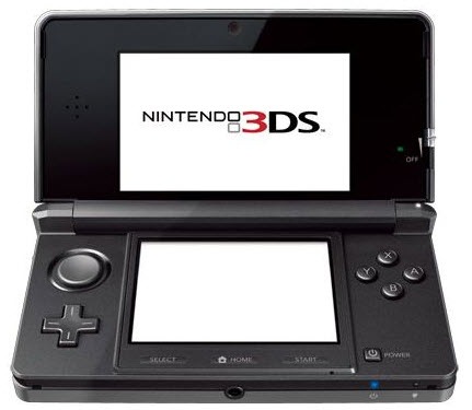
I have posted this image of the Nintendo 3DS because I believe it is proof that the 3D aspect is becoming very current and is the future for design. Due to be released at the end of March the games console works because the screen is small enough to fool the brain into thinking the image is in 3D without the need for glasses.

The Nintendo 3DS is also equipped with two frontal cameras which can be used at the same time to take three dimensional images in a process called stereopsis. This process can also be done with higher quality cameras and a computer program to produce the final image. Since my work is model based most of the difficulty in creating these three dimensional images is already overcome, this process is just not possible with drawings so essentially I am ahead of the game!

Taking three dimensional pictures of a world which can then be explored intuitively is a huge possibility in the very near future and my work could be adapted into this role with ease. I think my work is definitely heading in the right direction in terms of trends and fashions in the industry; 3D seems to be the next big thing, with all this talk about 3D television and games.

Tuesday, 1 February 2011

iPad: Evolution of Books


I think this video is very relevant to my project as it features the eBook 'Alice in Wonderland' on the iPad with animation and interactions. Watching this video was really quite helpful as it showed me what the iPad was actually capable of. For instance, the use of the iPad’s touch screen means things can move when they are tapped and it is also tilt sensitive so it can be tipped which makes objects fall or move around the screen.

This eBook seems perfect for young readers, the inclusion of interactions will intrigue a child and s the iPad can ‘read’ books out loud, they can learn without the company of an adult. I believe it will also make children's bedtime reading much more enjoyable for adults as well as young readers. The pages are vibrant and colourful which really attracts the eye and the yet the text is easy to read. All these aspects are things I should consider when creating imagery or trying to create the interactions and animations.

I have also had an idea as to how I would demonstrate how my ideas would look on the iPad’s screen. I could get a good photograph of an iPad and then print it off (in real size) and make a cardboard cut out/model of one. By filming my hands holding the iPad model, I could touch the screen with my finger which could then trigger the animation on the screen, similarly when I tip the iPad model side to side. This would be a good way of communicating my ideas for the animations and interactions.

Wednesday, 26 January 2011

Tolkien's Letters from Father Christmas - Enhanced Edition


I was researching some eBooks online and found this video of 'Tolkien's Letters from Father Christmas'. It features scanned in letters that have been hand written, which are to provoke the child into thinking Father Christmas has wrote them. I think it would be really exciting for children to read these and there is something authentic about them. The envelopes are also included and you can see where the letter was being sent and they feature little illustrated stamps. It’s very effective as it makes the story realistic and brings intrigue to young viewers. I like the idea of them having to open letters or a map on the screen; this is one method of interaction that I could consider.

Sunday, 9 January 2011

See Wired Magazine on iPad


My tutor Ian Murray showed me this link discussing the Wired magazine on the iPad. It features the magazine on screen and being able to rotate advertised products 360 degrees. This is a good idea to consider for my models in the story. The magazine features simple movements on the screen and nothing too complicated which is something to consider when I produce my animations for the eBook because I don't want anything too busy on the page as it will distract the viewer’s eye from the story.