Labels
- 7x7 brief (14)
- Animation (3)
- collaboration brief (3)
- conference (2)
- Contact Illustrators (6)
- Critical and History studies (6)
- Editorial Brief 1. (1)
- Editorial Brief 2. (2)
- Figure project (4)
- FMP (74)
- PDP (31)
- Personal (20)
- Personal Project (28)
- Photographic project (5)
- Practitioners (1)
- Research (50)
- Ted Baker window display Brief (8)
- Water Brief (1)
Tuesday, 24 May 2011
Saturday, 21 May 2011
Sunday, 15 May 2011
Evaluation on the Final Major Project
It has come to the end of this project (well a bit more to do on it for the show) and I think over all I have answered my proposal well for my final major project. I'm really happy with my progress during these past few months and I think my work has moved on a lot since the 'Negotiated Project'. This has made me improve as a practitioner. Even the things I have been really bad at, (time management) being one of them, I feel I really got it together for this last project and produced a healthy amount of work.
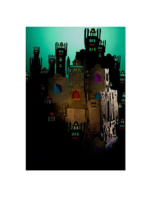
Whilst viewing my final images, I think they work as a set for the tale of 'Hansel and Gretel' for the iPad. They match my audience well, as I wanted them to be exciting and intriguing for children but sophisticated and elegant for adults as well. I have managed to create all them aspects in my work whilst sustaining the magical quality to the story. Although I admit that my images do need more improvement because it doesn't matter what I produce, I'm never fully happy with the end result. However the things I do think I have improved on is considering the context and my audience a lot more. By doing this I have now got a proper end result which fits into a genre and it gives the tutors as well as commissioners somewhere they could perhaps see my work suiting or lending itself to well?
One of my biggest improvements has been my time management, as I left enough time to photograph everything and to work on the 'finishing' of the image. Rather than putting all my time into the constructing and making of my models and being completely absorbed within the process that I forgot about everything else. So I think this is one of the biggest aspects to this project I am pleased with.
My three favourite images are the swan composition, the treasure chest composition and the sweet house composition. These images are my strongest of all the imagery I have produced for this project and I feel most proud about these pieces. I think because they are all well made, intricate models that seem to work fine on their own within a photograph. This is something I have always had trouble with before, making something really intricate and then totally over doing it but I think what I have done successfully this time was isolate my models nicely within the photograph where they have been able to breathe and let the space around them compliment them.
Whilst producing work for this project I have began to understand the process of producing work for a client a lot better. I've realised the importance of 'roughs' and the small changes to an image whilst in the development stage that can make all the difference between something you think is finished and to what is actually a finished image.
If I were to have additional time on this project, I think the next step would be to start properly animating the models and develop them ideas which could then become the interactive ideas which would feature upon the iPad. I think my work is suited to animation as I work in 3D and they can look effective in the animation program iStop because of the advantages of the several different angles.
I'm actually excited to carry on with this project and pushing my ideas further and further even after this course. I will definitely be producing more work for the show and I would like this project to be the best it could be, so I think a little more pushing and motivation is in order for me to just keep producing.
My email to Pheonix Yard Books
Hi,
My name is Gemma Beaven and i'm a student in my third year at Stockport College currently studying illustration. I'm nearing the end of my course now and I was just wondering if you could possibly give me some feedback on my work. What style of portfolio's catch your eye? How could I improve my PDF portfolio? Do you prefer illustrators to come and visit you in person to talk about work or is it easier for you to receive work by post or email? Is there any previous briefs that you could send and I could have a go at for some work experience?
Thank you for taking the time to read this email. I have attached my PDF portfolio to this email for you to have a look. I look forward to your response, any feedback or advice would be strongly welcomed!
Many Thanks!
Gemma
I also sent my online pdf to Jo lynn Alcorn who has already previously responded to my questions. I have asked for her feedback on my work for final major project and how I can possibly improve my work. We also exchanged people to research and look at who could inspire our work which was extremely helpful!
My name is Gemma Beaven and i'm a student in my third year at Stockport College currently studying illustration. I'm nearing the end of my course now and I was just wondering if you could possibly give me some feedback on my work. What style of portfolio's catch your eye? How could I improve my PDF portfolio? Do you prefer illustrators to come and visit you in person to talk about work or is it easier for you to receive work by post or email? Is there any previous briefs that you could send and I could have a go at for some work experience?
Thank you for taking the time to read this email. I have attached my PDF portfolio to this email for you to have a look. I look forward to your response, any feedback or advice would be strongly welcomed!
Many Thanks!
Gemma
Response by Emma Langley:
Thank you for submitting your book proposal and/or illustrations to Phoenix Yard Books. We endeavour to respond to all manuscript submissions as quickly as possible but please allow up to 12 weeks for a response. Regrettably, due to the large volume of submissions we receive, we are unable to provide editorial comments and feedback on submissions.
ILLUSTRATORS: We do not reply to individual illustration submissions but we do keep all samples of artwork we like on a file that we refer back to as and when a suitable commission arises.
Thank you again for your interest in our company.
All best wishes
Phoenix Yard Books – Editorial
Phoenix Yard
65 King' s Cross Road
London
WC1X 9LW
Tel: (+44) 020 7239 4968
I also sent my online pdf to Jo lynn Alcorn who has already previously responded to my questions. I have asked for her feedback on my work for final major project and how I can possibly improve my work. We also exchanged people to research and look at who could inspire our work which was extremely helpful!
My images in the iPad format.
These are a few of my images shown on the iPad and where the text would be situated within the image. I have an iPad of my own and I have uploaded the images on it to get more of a knowledge of how they would look on the screen. This especially helped me with being able to decide on a font for the text and the size. The text size is currently size 11 but unfortunately in these images the text is really small so you can't see it very well but it when viewing it on the screen on the iPad it seems to be big enough to read on the screen but not interfere with the image. I also chose a very simple type 'Helvetica' so that it was easy to read and i was advised that the 'Helvetica' font can afford to be made much smaller and still look fancy and intricate whilst being readable at the same time.
My first print outs of the images in the iPad format, the text was perhaps too big and too bright as I chose the colour white for the text and with all my images featuring on a black background this was perhaps too much of a contrast and made the text scream out too much. The two images at the top are examples of me exploring different colours for the texts such as a very light grey or a mustard, ginger colour which is featured in every one of my images so this made them synchronize with each other and they looked more as though they are part of a set.
Thursday, 12 May 2011
Theatre posters on Hansel and Gretel
I have printed out these designs for theatre posters at A2 size, unfortunately I was only able to print them on a much thinner paper and with less shine so the prints didn't have that flourish and rich colour quality the other images printed in the iPad format have. For the final show I will have these posters printed out A2 like these ones or perhaps even A1.
I have done two different versions of each poster ( they have all been printed out) but i thought these are the ones that worked the best. I happy with the layout of the image with the type, I think they are easy to read and are quite eye catching. I think they all work very nicely as a set and the images don't give too much away if it were a performance.
The top poster with the 'Hansel and Gretel' title doesn't quite work yet, as i'm not happy with the word 'and' in the image. It doesn't seem to fit within the image. It looks as though I have just tried to squeeze it in. I tried several versions of the type with my tutor Gary but when I printed it out we both agreed that it still wasn't working. I think this is something I need to work on for the show. Despite the 'and' not working i'm really happy with the composition of the image, the text is encased in the arch of the fire which puts the main focus upon the most important element to the image. I like the contrast of the dark fire and the colourful letters made from sweets, they look like they could melt in the fire.
On my first versions of the posters I was using 'The Palace Theatre' logos instead of the 'Royal Exchange' logo which was black text on a white background. I think the 'Royal Exchange' one works much better as its white text on a black ground and helps it to blend into the background, makes it much more subtle.
Wednesday, 11 May 2011
Final images with text for the iPad
These images are almost finished as they are in the right format and the text has been added to them in the appropriate places. I think the size of the text and colour still needs work and on some of the images there is a black line from when I printed off the images, my tutor Ian noticed it and thought it cropped the images too harshly so I think a bit of blurring on the harsh line above the text will improve them quite a lot but overall I am really pleased with the images as sets, they all seem to sit nicely together because they have similar colour palettes.
The two landscape images at the top, are examples of what they might look when you tip the iPad and view the images landscape. I had the idea that when you tipped it either way the images could change slightly, this might make it that extra exciting or hold that little bit more intrigue.
I think I prefer the two landscape images of the woodcutter and the witch as they work better with more space around the figures. They can breathe more.
Tuesday, 10 May 2011
Bird and bread crumb image
When I showed my tutor Ian the bird image his feedback was really helpful because I didn't know what else to do with the image, after looking at it so long. He suggesting putting a white line or use a colour from the trees and draw around the shape of the head and the left hand side of the wing to highlight the bird because in the previous image, the bird seem to be swallowed up by the darkness. I took his advice and tried doing that with the line but it didn't seem to look natural it might have been because of my very basic skills at Photoshop but instead I used some different trees to highlight the shape of the bird instead, I think this works effectively because the bird now looks as though its emerging from the darkness. It has an ominous feel to it which portrays that part of Hansel and Gretel well, as the birds are what condemn Hansel and Gretel to being lost in the woods.
Hansel and Gretel
These images are to show how I got to my final image of the Hansel and Gretel. The bottom two are the original photographs I had taken of the set. I have had to add depth to the image by adding thinner, different trees. Because I made the characters legs and hand black they have gotten lost in the black background so I have also had to highlight the hands and the legs with the same colour skin tone I have used for the faces.
The witch
This is the witch image and how i've developed it. I had to re-photograph the witch three times in three different sets because I couldn't get the right shot of her. Eventually after the third photographing session I had several photographs to choose from. Unfortunately the photograph I chose for the final image only shows the witch's head, arm and walking stick. The detail on the cloak with all the liquorice is hidden but I felt that the image I chose looked more effective with the witch peering out from the bush. It looks more creepy.
Monday, 9 May 2011
Hansel and Gretel half finished animation
I have added a bit more animation, for more ideas as to what could happen when producing ideas for interaction. I took Ian Murray's advice/ideas for the title 'Hansel and Gretel' appearing on the screen for the first few moments and perhaps they could move? Well this was me taking his advice on board and then changing it around for what worked best for me.
The woodcutter
The photos's are a storyboard of how I developed the woodcutter image. I prefer the colder lit photographs than the ones that have the orange and red tinge to them. Like in other images I have added more trees to this image, smaller and thinner ones to add depth.
The top two images are my final ones although I can make up my mind about the white gravel on the floor. I may have a go at blackening the floor out. However I think the floor helps the element of depth within the photograph and it stops the woodcutter look as though he is suspended or floating on air.
Sunday, 8 May 2011
Hansel and Gretel lettering
These images are different versions of the title image. I think the darkest lit one works the best as the image looks a lot darker and is a great contrast against the brightly coloured letters.
The next step is for me to add the 'and' in the middle but I'm struggling with choosing the font and whether to write the word ' and ' or use an ampersand (&) to save space between the lettering.
Saturday, 7 May 2011
Pocket Mirrors artefact
I can order 50 of these mirrors for £35 and all I have to do is upload my designs. I think they mirrors are mainly aimed at females but I think this compliments my work.
Subscribe to:
Posts (Atom)