Thursday 29 April 2010

Inspiration


This is a photograph that Katy introduced me to and we got the idea of getting some black and white checked material and using this as a drop cloth for our black and white models. A bit like I had done with the previous Ted Baker brief where I created a Diamond patterned backdrop in illustrator. I think that it worked well last time but it could over complicate the image and take the emphasis off the actual models but I guess we'll have to see when we experiment in the photo studio. . .

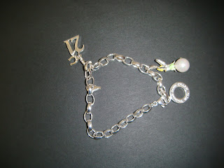
The Charm Bracelet


The huge charm bracelet that me and Katy made to drape around the paper woman. . .

The Set Coming Together


These are photographs that we took after all the models were taken.

Set Characters


These are the little paper characters that Katy made for our set. The idea of placing this character in a real pint glass was to reflect the fact that we was in the pub. . .

Set Elements


These are some of the elements mentioned in the story that we were including in our set.

Wednesday 28 April 2010

Water Brief Work


These images were created for my Water Brief project. We were originally briefed about this in November but I didn't get into the brief as much as I would have liked. I didn't enjoy it as much as the other briefs like the Ted Baker window display and the 7x7 collaboration brief. I think maybe it was the subject which we were researching or perhaps I misunderstood the aims of the brief. However I was given another chance to do the same brief, unfortunately we weren't given a new subject so I had to visit the dreaded water subject again. . .

So in the end I came up with these images. I think they would have turned out a lot better if I had managed to get my paper models inside the photostudio, where I would have had the opportunity to play around with lighting and shadows. I think this would have helped to make the the tsunami look a lot more overpowering and dramatic.

What I do like about these images is the colour and the idea of using blue material for the water, I think it looks quite convincing.

Charm Bracelet - Another Idea for the 7x7 Brief


Another important element to the story and an idea me and Katy really wanted to pursue was the charm bracelet that is mentioned. We thought it might stand for protection and luck, maybe even relating back to the idea of hope?

So our next idea for the 2nd illustration was to make a large scaled women passed out on the floor (like the real life model lay down in the image above by Container Plus) but we want to make her out of paper and combine drawing and using other materials. For example, we want to get some material and make the huge women look as though she is wearing a dress and have it draping out onto the floor along with her hair...

Then we are hoping to make a large scaled charm bracelet out of material and then with the addition of paper charms (the pram, the crucifix and the heart mentioned in the story). We then want to drape the charm bracelet over her like the Container Plus's image above and make it so it looks as though it's protecting her. These models will also be taken into the photographic studio and we shall play around with different lighting and colours.

The Magic Lantern- An Idea for the 7x7 Brief


The idea of the magic lantern mentioned in Joanne's story a couple of times made me think of experimenting with light and the different coloured filters in the photographic studio to create a stained glass effect. This isn't even limitted to just the lantern, it could also refer to the idea of the church and even the idea of hope itself.

This is a lantern that I have in my garden at home, which I thought was perfect! It was exactly what Jo had described about the magic lantern in her story and I love the stain glass pattern effect that it already has on it!

Container Plus- Inspiration for the 7x7 Brief


I thought about looking at some of Container Plus's work (like I have done so with many other projects) and I thought the idea of making words or text and placing it alongside the paper models and real objects and then photographing it was really interesting.

Me and Katy have decided to work together and she was also fond of these images and ideas. We both had corresponding ideas of building our own paper set like Container Plus do, including real objects and then photographing the models in the photographic studio and possibly playing with some lighting effects.

The image with the typewriter (all the little drawings and paper models look as though they are coming to life out of the typewriter) was the main influence for one of the illustrations, we liked the concept of creating all the elements and characters from the story and arranging them so that they look like they are pouring out of the main element of the story, which was the church.

Inspiration for the 7x7 Story


After reading the story by Joanne Key "When a Door Opens", I was delighted! I think that there are a lot of elements within the story that I could work with. My friend John has given me these photographs from when he was in Prague and I thought these really related to the imagery that was running through my mind while reading the story.

The fact that the story is based around a church and it mentions the 'church clock tower' really got me thinking about how to incorporate it into my work. I also really like the idea of creating a set based around a Gothic style. In Joanne's story, she portrays a lot of imagery about light shining through the stain glass windows and hints at the light symbolising hope.

London and Rome are Burning


I uploaded this image on here because it's similar to what I like to produce at some point. I like the way the silhouettes are placed onto a background, in this case the fire, I think its really effective how you can see the fire burning behind what is supposed to be the skylines of London and Rome . I think it's such a simple idea but works brilliantly.

Emma Van Leest


Here is a link to Emma's website

Emma's work reminds me of Aoyama Hina's complicated paper cut outs. They are extremely complicated designs and look as though they have taken ages to produce. I really like the paper lantern, I think it looks really beautiful when its lit up as the layers of the paper silhouettes create shadows and give the image depth.

Warhammer Church


Pictures of my dad's Warhammer painted church . . .